The government has recently published the English indices of multiple deprivation for 2025 – the first release on relative deprivation levels since 2019.
They use seven different measures to calculate a figure that approximates how deprived each area is (hence “multiple”), and then they rank (hence “index”) everywhere in the country based on that score. The measures used relate to income, employment, education, health, crime, housing, and the quality of the local environment.
I’ve taken a look at what the figures say about my neck of the woods – mainly Greater Manchester, but first of all here’s a look at the North West as a whole, because of Blackpool up in Lancashire.
The red areas on the map below show the more deprived spots, and the blue areas the less deprived.
It’s done using LSOA-scale data (Lower layer Super Output Areas) – these are very small geographical units of just 1,000 to 3,000 residents each. That does mean the map looks a bit overwhelming, because of how small each coloured area is.
But you can clearly see a few high concentrations of deep red – especially around Blackpool.
Blackpool doesn’t contain the most deprived LSOA area in England – that’s in Tendring in Clacton-on-Sea, Essex – but it does contain a staggering seven of the 10 most deprived, and 10 out of the top 20.
Here’s the list of the most deprived spots nationwide – to show that point about Blackpool more clearly.
Returning to the map – as well as the concentration of red areas around Blackpool, the other striking thing it shows is how closely juxtaposed dark red and dark blue areas often are. Highly deprived and highly privileged areas often sit in surprisingly close proximity.
So here’s just Greater Manchester – and just those areas ranked in either the first or tenth decile, i.e. the most and least deprived 10% in England.
Those huge swathes of Manchester that are red are noted in the official statistical release: Manchester has one of the highest concentrations of highly deprived areas across the country.
Yet – down south – it contains a few of the least deprived, too. And the same is true elsewhere. Remarkably, in more than half of the boroughs (six out of ten), at least one most-deprived area borders a least-deprived area, and there’s another such border between Manchester and Rochdale.
Which, it turns out, is actually not as atypical as you might assume. More than half of England’s local authorities contain areas that rank among both the most and least deprived – 156 out of 296, or 61%.
Extremes of deprivation in Stockport
Even given that statistic, Stockport remains exceptional.
It turns out that Stockport has the widest gap between its most and least deprived areas of any local authority in England.
The chart below shows the difference in ranking between a council’s most deprived LSOA and its least deprived. At the top are the 15 with the widest such range, and below are the 15 with the narrowest range. (Rutland isn’t a particularly surprising last place, as it is much smaller than an average LA and thus contains fewer LSOAs.)
Stockport, as you can see, is very comfortably in top place, containing both the highest and lowest ranking LSOAs of any of these top 15 councils. Given all that, it’s no surprise at all (but still worth noting) that it contains both the most and the least deprived areas in Greater Manchester.
That most deprived area in Stockport, for the record, is coded as Stockport 014D, an area in Central Stockport, Portwood & Shaw Heath, and it’s the 21st most deprived area in England. Stockport 034B, meanwhile, is in Cheadle Hulme West, and is the sixth least deprived area in the country (out of 33,755).
Deprivation extremes in adjacent neighbourhoods
Of course, and as that map above shows, Stockport isn’t just the town itself – the local authority of Stockport also includes surrounding areas such as the famously leafy Heatons. So some variation across the whole borough is to be expected.
How extreme is it when it comes to LSOAs that literally border each other? Still quite extreme, actually.
The below map shows the adjacent areas in the North West with the biggest differences in deprivation ranking. And Stockport still ranks highly.
Specifically, the adjacent areas Stockport 005B and Stockport 010D respectively rank as the 1,612nd and 33,266th most deprived areas in the country – and that difference of more than 30,000 places on the list is the eighth widest in the country.
(If you’re curious about the largest difference nationally, that’s in Southend-on-Sea, between areas 017A and 017C.)
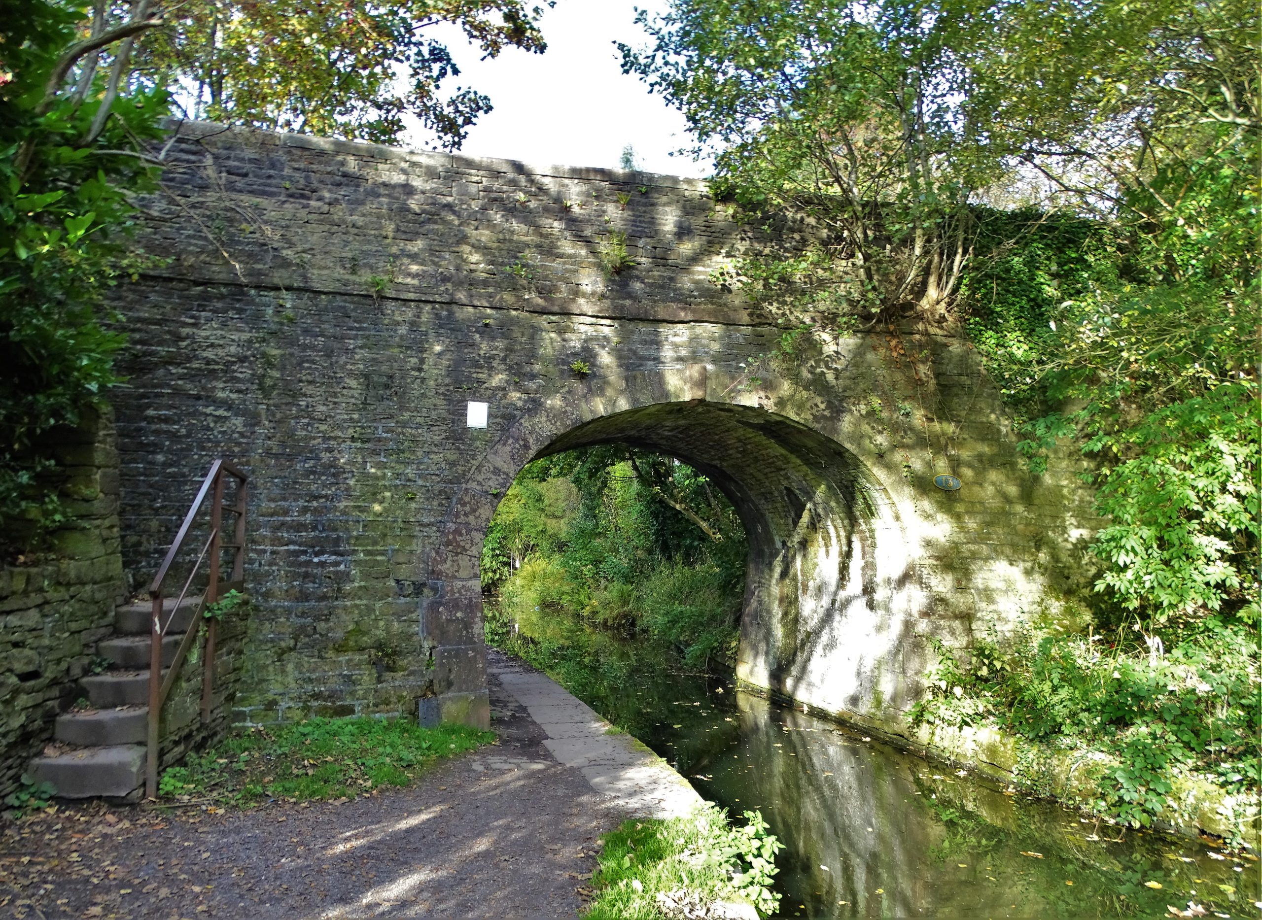
And if you’re wondering where that border in Stockport actually is – it’s the image at the top of this post, via the ever-astonishing Geograph. As you can just about tell from the map, it’s a very small border. It’s around the Heald Park area in Woodley, just by the canal.
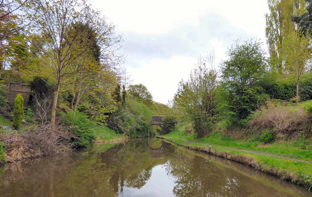
Here’s another, from the other side. This is taken from Stockport 005B – the deprived area – looking over to the bridge, where the less deprived part starts.
Sources and notes
IMD data is all from the Ministry of Housing, Communities and Local Government, and available here.
LSOA boundary adjacencies were mapped using data from the ONS’s Open Georgraphy portal.
The analysis was done in Python and is available via GitHub.
Feature image: Bridge Number 13, Peak Forest Canal. © Copyright Neil Theasby and licensed for reuse under this Creative Commons Licence. Via Geograph.
Leave a Reply